2. tk Button
2.1. Usage
- button_widget = tk.Button(parent, option=value)
- parent is the window or frame object.Options can be passed as parameters separated by commas.
2.2. Sample button
initial
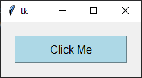
pressed

pack(), grid() or place().import tkinter as tk
root = tk.Tk()
root.title("Button Widget Example")
root.geometry("350x100")
# Creating a button with specified options
button = tk.Button(
root,
text="Button",
fg="black", # Text color
bg="lightblue", # Background color
activebackground="blue", # Background color when clicked
activeforeground="white", # Text color when clicked
font=("Arial", 12),
padx=10,
pady=5,
width=15,
)
button.pack(padx=20, pady=20)
root.mainloop()
Tasks
Modify the code above to change the window title to "Button question," set the window size to 350x100, set the button text to "Click Me", a light gray background, black text color, a black background when clicked, white text when clicked, Arial font size 14, centered text alignment, a border width of 3, a height of 2, a hand-shaped cursor on hover, a raised border style, a sunken border style on hovering over the button, horizontal inside padding of 10, vertical inside padding of 5, a width of 15, and text wrapping after 50 pixels, and adjust the pack method to add padding of 20 pixels on all sides.

Modify the code above to change the window title to "Button question," set the window size to 350x100, set the button text to "Click Me", a light gray background, black text color, a black background when clicked, white text when clicked, Arial font size 14, centered text alignment, a border width of 3, a height of 2, a hand-shaped cursor on hover, a raised border style, a sunken border style on hovering over the button, horizontal inside padding of 10, vertical inside padding of 5, a width of 15, and text wrapping after 50 pixels, and adjust the pack method to add padding of 20 pixels on all sides.
import tkinter as tk

# Create a new window
root = tk.Tk()
# Set the title of the window
root.title("Button question")
# Set the size of the window
root.geometry("350x100")

button = tk.Button(
    root,
    # Set the text displayed on the button
    text="Click Me",
    # Set the background color of the button
    bg="lightgray",
    # Set the text color of the button
    fg="black",
    # Set the background color when the button is active (clicked)
    activebackground="black",
    # Set the text color when the button is active (clicked)
    activeforeground="white",
    # Set the font of the button text
    font=("Arial", 14),
    # Set the alignment of the text within the button
    anchor="center",
    # Set the border width of the button
    bd=3,
    # Set the height of the button
    height=2,
    # Set the cursor that appears when hovering over the button
    cursor="hand2",
    # Set the relief style of the button
    relief="raised",
    # Set the relief style of the button when hovering over the button
    overrelief="sunken",
    # Set the padding around the text inside the button (horizontal)
    padx=10,
    # Set the padding around the text inside the button (vertical)
    pady=5,
    # Set the width of the button
    width=15,
    # Set the maximum line length for the text before wrapping
    wraplength=50,
)


button.pack(padx=20, pady=20)

root.mainloop()
2.3. Methods
- button_widget.invoke()
- Calls the button's
commandcallback as though the button had been clicked.
- button_widget.flash()
- Briefly flashes the button between its active and normal colours.
- button_widget.config(option=value)
- Changes one or more button options after the button has been created.
2.4. Parameter syntax
- button_widget = tk.Button(parent, option=value)
- parent is the window or frame object.Options can be passed as parameters separated by commas.
Parameters:
- activebackground
- Syntax:
button_widget = tk.Button(parent, activebackground="color")Description: Sets the background color of the button when it is active or pressed.Default: SystemButtonFace RGB: (240, 240, 240)Example:button_widget = tk.Button(root, activebackground="lightblue")
- activeforeground
- Syntax:
button_widget = tk.Button(parent, activeforeground="color")Description: Sets the foreground (text) color of the button when it is active or pressed.Default: SystemButtonText RGB: (0, 0, 0)Example:button_widget = tk.Button(root, activeforeground="white")
- anchor
- Syntax:
button_widget = tk.Button(parent, anchor="position")Description: Determines where the text is positioned within the button. Position values are "center", "n", "s", "e", "w", "ne", "nw", "se", "sw".Default:"center"Example:button_widget = tk.Button(root, anchor="center")
- background
- bg
- Syntax:
button_widget = tk.Button(parent, bg="color")Description: Sets the background color of the button.Default: SystemButtonFace RGB: (240, 240, 240)Example:button_widget = tk.Button(root, bg="blue")
- bitmap
- Syntax:
button_widget = tk.Button(parent, bitmap="bitmap_name")Description: Sets a bitmap to be displayed on the button.Default:NoneExample:button_widget = tk.Button(root, bitmap="error")
- borderwidth
- bd
- Syntax:
button_widget = tk.Button(parent, bd=width)Description: Sets the width of the button's border.Default:2Example:button_widget = tk.Button(root, bd=2)
- command
- Syntax:
button_widget = tk.Button(parent, command=callback_function)Description: Specifies the function to call when the button is clicked. Do not include parentheses after the function name.Default:NoneExample:button_widget = tk.Button(root, command=on_click)
- compound
- Syntax:
button_widget = tk.Button(parent, compound="position")Description: Specifies the relative position of the image and text on the button. Common values are "top", "bottom", "left", "right", "center".Default:NoneExample:button_widget = tk.Button(root, compound="left")
- cursor
- Syntax:
button_widget = tk.Button(parent, cursor="cursor_type")Description: Changes the mouse cursor when it hovers over the button.Default:NoneExample:button_widget = tk.Button(root, cursor="hand2")Possible values include: - "arrow": Standard arrow cursor. - "circle": Small circle cursor. - "clock": Clock or watch cursor. - "cross": Crosshair cursor. - "dotbox": Dotted box cursor. - "exchange": Arrows pointing in opposite directions. - "fleur": Four-way arrow for moving. - "hand2": Hand cursor, commonly used to indicate a clickable item. - "heart": Heart-shaped cursor. - "man": Icon of a person. - "mouse": Cursor shaped like a mouse. - "pirate": Skull-and-crossbones cursor. - "plus": Plus sign cursor. - "shuttle": Shuttle or spaceship. - "sizing": Cursor for resizing. - "spider": Spider cursor. - "spraycan": Spray can cursor. - "star": Star-shaped cursor. - "target": Target or bullseye cursor. - "tcross": T-shaped crosshair cursor. - "umbrella": Umbrella cursor. - "wait": Hourglass or watch cursor. - "xterm": I-beam cursor, commonly used for text selection.
- default
- Syntax:
button_widget = tk.Button(parent, default="state")Description: Sets the default button state. State values are "normal", "active", "disabled".Default:"disabled"Example:button_widget = tk.Button(root, default="active")
- disabledforeground
- Syntax:
button_widget = tk.Button(parent, disabledforeground="color")Description: Sets the foreground (text) color of the button when it is disabled.Default: SystemDisabledText RGB: (109, 109, 109)Example:button_widget = tk.Button(root, disabledforeground="grey")
- fg
- foreground
- Syntax:
button_widget = tk.Button(parent, fg="color")Description: Sets the foreground (text) color of the button.Default: SystemButtonText RGB: (0, 0, 0)Example:button_widget = tk.Button(root, fg="white")
- font
- Syntax:
button_widget = tk.Button(parent, font=("font_name", size))Description: Sets the font type and size of the button text.Default:None; Default Font Family: Segoe UI; Default Font Size: 9Example:button_widget = tk.Button(root, font=("Arial", 12))
- height
- Syntax:
button_widget = tk.Button(parent, height=height_in_lines)Description: Sets the height of the button in lines of text.Default:NoneExample:button_widget = tk.Button(root, height=2)
- highlightbackground
- Syntax:
button_widget = tk.Button(parent, highlightbackground="color")Description: Sets the color of the focus highlight when the button does not have focus.Default: SystemButtonFace RGB: (240, 240, 240)Example:button_widget = tk.Button(root, highlightbackground="black")
- highlightcolor
- Syntax:
button_widget = tk.Button(parent, highlightcolor="color")Description: Sets the color of the focus highlight when the button has focus.Default: SystemWindowFrame RGB: (100, 100, 100)Example:button_widget = tk.Button(root, highlightcolor="red")
- highlightthickness
- Syntax:
button_widget = tk.Button(parent, highlightthickness=thickness)Description: Sets the thickness of the focus highlight.Default:1Example:button_widget = tk.Button(root, highlightthickness=1)
- image
- Syntax:
button_widget = tk.Button(parent, image=image_object)Description: Sets an image to be displayed on the button.Default:NoneExample:button_widget = tk.Button(root, image=my_image)
- justify
- Syntax:
button_widget = tk.Button(parent, justify="alignment")Description: Specifies how multiple lines of text are aligned. Alignment values are "left", "center", "right".Default:"center"Example:button_widget = tk.Button(root, justify="center")
- overrelief
- Syntax:
button_widget = tk.Button(parent, overrelief="relief_type")Description: Sets the border style while the mouse pointer is over the button. Common values are "raised", "sunken", "flat", "ridge", "solid", "groove".Default:NoneExample:button_widget = tk.Button(root, overrelief="raised")
- padx
- Syntax:
button_widget = tk.Button(parent, padx=padding)Description: Sets the horizontal padding inside the button.Default:1Example:button_widget = tk.Button(root, padx=10)
- pady
- Syntax:
button_widget = tk.Button(parent, pady=padding)Description: Sets the vertical padding inside the button.Default:1Example:button_widget = tk.Button(root, pady=5)
- relief
- Syntax:
button_widget = tk.Button(parent, relief="relief_type")Description: Sets the border style of the button. Common values are "flat", "raised", "sunken", "ridge", "solid", "groove".Default:"raised"Example:button_widget = tk.Button(root, relief="solid")
- repeatdelay
- Syntax:
button_widget = tk.Button(parent, repeatdelay=delay_ms)Description: Sets the delay in milliseconds before the button action repeats when held down.Default:NoneExample:button_widget = tk.Button(root, repeatdelay=500)
- repeatinterval
- Syntax:
button_widget = tk.Button(parent, repeatinterval=interval_ms)Description: Sets the interval in milliseconds between repeats when the button is held down.Default:NoneExample:button_widget = tk.Button(root, repeatinterval=100)
- state
- Syntax:
button_widget = tk.Button(parent, state="state")Description: Sets the state of the button. State values are "normal", "active", "disabled".Default:"normal"Example:button_widget = tk.Button(root, state="disabled")
- takefocus
- Syntax:
button_widget = tk.Button(parent, takefocus=boolean)Description: Determines whether the button can receive focus via the Tab key.Default:NoneExample:button_widget = tk.Button(root, takefocus=True)
- text
- Syntax:
button_widget = tk.Button(parent, text="text")Description: Sets the text displayed on the button.Default:""Example:button_widget = tk.Button(root, text="Click Me")
- textvariable
- Syntax:
button_widget = tk.Button(parent, textvariable=stringvar)Description: Binds a StringVar variable to the button's text, allowing dynamic updates.Default:NoneExample:button_widget = tk.Button(root, textvariable=my_var)
- underline
- Syntax:
button_widget = tk.Button(parent, underline=index)Description: Specifies the index of the character in the text to underline.Default:-1(No underline)Example:button_widget = tk.Button(root, text="Save", underline=1)
- width
- Syntax:
button_widget = tk.Button(parent, width=width_in_chars)Description: Sets the width of the button in characters.Default:NoneExample:button_widget = tk.Button(root, width=10)
- wraplength
- Syntax:
button_widget = tk.Button(parent, wraplength=width_in_pixels)Description: Specifies the width (in pixels) at which the text should wrap to the next line.Default:0(No wrapping)Example:button_widget = tk.Button(root, wraplength=100)
2.5. Default options
import tkinter as tk

root = tk.Tk()

widget = tk.Button(root)
widget_options = widget.keys()

for option in widget_options:
    print(f"{option}: {widget.cget(option)}")  # cget retrieves the current value of the option