3. ttk Label
3.1. Usage
ttk widgets offer a more modern appearance across different operating systems compared to classic tk widgets.- label_widget = ttk.Label(parent, option=value)
- parent is the window or frame object.Options can be passed as parameters separated by commas.
3.2. Text
- label_widget = ttk.Label(parent, text=text_string)
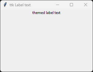
- text_string is text to display in the label widget.e.g. label = ttk.Label(root, text="themed label text")
3.2.1. Text example
import tkinter as tk
from tkinter import ttk

# Create the main window
root = tk.Tk()
root.geometry("300x200")  # Set window size
root.title("ttk Label text")  # Set window title

# Create the themed label widget
label = ttk.Label(root, text="themed label text")

# Pack the label into the window
label.pack()

# Run the main event loop
root.mainloop()
3.3. Font
- label_widget = ttk.Label(parent, font=(font_type, font_size, font_style))
font_type is a font name. e.g "Arial"
font_size is the size of the font. eg. 12
font_style can be bold, italic, underline or a space separated combination
Default Value: System-dependent themed default font
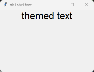
Description: Specifies the font family, size, and style for the themed label text.
3.3.1. font example
import tkinter as tk
from tkinter import ttk

# Create the main window
root = tk.Tk()
root.geometry("300x200")  # Set window size
root.title("ttk Label font")  # Set window title

# Create the label widget with options
label = ttk.Label(root, text="themed text", font=("Arial", 24))

# Pack the label into the window
label.pack()

# Run the main event loop
root.mainloop()
3.4. Padding
- label_widget = ttk.Label(parent, padding=padding_value)
padding_value can be a single integer, a tuple of two integers
(x, y), or a tuple of four integers(left, top, right, bottom).Default Value: 0
Description: Adds extra space (in pixels) inside the widget border surrounding the text.
Note: Unlike classic
tk.Labelwhich usespadxandpady,ttk.Labeluses a singlepaddingparameter.
3.4.1. padding example
import tkinter as tk
from tkinter import ttk

# Create the main window
root = tk.Tk()
root.geometry("300x200")  # Set window size
root.title("ttk Label padding")  # Set window title

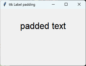
# Create the label widget with 40 pixels left/right and 20 pixels top/bottom padding
label = ttk.Label(root, text="padded text", font=("Arial", 24), padding=(40, 20))

# Pack the label into the window
label.pack(pady=20)

# Run the main event loop
root.mainloop()
3.5. Styling
ttk.Style object.- style.configure("Name.TWidget", option=value)
Name.TWidget: A string combining your custom name and the target widget class (e.g., "Highlight.TButton").
option: A keyword argument specifying the attribute to change (e.g., background, foreground, font).
Description: Defines the visual properties for a specific widget class. The configuration applies to all widgets assigned to this style name. The style name can be used to apply the configuration to multiple widgets.
import tkinter as tk
from tkinter import ttk

root = tk.Tk()
root.geometry("300x200")
root.title("ttk Label Styling")
root.configure(bg='#f0f0f0')  #default

style = ttk.Style()

# Define the font within the style configuration
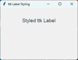
style.configure(
    "Custom.TLabel",
    foreground="#36454F",
    background="#f0f0f0",
    font=("Arial", 14),  # Font included here
    padding=(10, 10),
)

# Style applied here; no need to pass font= parameter
label = ttk.Label(root, text="Styled ttk Label", style="Custom.TLabel")
label.pack(pady=25)

root.mainloop()
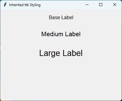
import tkinter as tk
from tkinter import ttk

root = tk.Tk()
root.geometry("400x300")
root.title("Inherited ttk Styling")

style = ttk.Style()

# 1. Base style: Defines shared properties (colors, relief, etc.)
style.configure("Base.TLabel",
    foreground="#000000",
    background="#E4E4E4",
    font=("Arial", 12),
    padding=(10, 5),
)

# 2. Inherit and override: Each child overrides font AND the background color

style.configure("Medium.Base.TLabel", font=("Arial", 16))

style.configure("Large.Base.TLabel", font=("Arial", 20))

# 3. Apply the specific styles
label1 = ttk.Label(root, text="Base Label", style="Base.TLabel")
label1.pack(pady=10)

label2 = ttk.Label(root, text="Medium Label", style="Medium.Base.TLabel")
label2.pack(pady=10)

label3 = ttk.Label(root, text="Large Label", style="Large.Base.TLabel")
label3.pack(pady=10)

root.mainloop()
3.6. Options
- label_widget = ttk.Label(parent, option=value)
- parent is the window or frame object.Options can be passed as parameters separated by commas.
Parameters:
- anchor
- Syntax:
label_widget = ttk.Label(parent, anchor="position")Description: Specifies how the information is positioned within the widget if there is extra space. Options are "nw", "n", "ne", "w", "center", "e", "sw", "s", "se".Default: center
- compound
- Syntax:
label_widget = ttk.Label(parent, compound="position")Description: Specifies the relative position of the image relative to the text. Options include "none", "center", "top", "bottom", "left", "right".Default: none
- cursor
- Syntax:
label_widget = ttk.Label(parent, cursor="cursor_type")Description: Sets the mouse cursor appearance when hovering over the label.Default: None
- font
- Syntax:
label_widget = ttk.Label(parent, font="font")Description: Sets the font of the label text.Default: TkDefaultFont
- image
- Syntax:
label_widget = ttk.Label(parent, image="image")Description: Sets an image to be displayed in the label. If specified, it can be combined with text using thecompoundoption.Default: None
- justify
- Syntax:
label_widget = ttk.Label(parent, justify="alignment")Description: Sets the justification of multi-line text within the widget layout bounds. Use "left", "right", or "center".Default: left
- padding
- Syntax:
label_widget = ttk.Label(parent, padding=value)Description: Sets internal padding inside the widget border. Can accept a single value or multi-integer element collections (e.g.,(x, y)).Default: 0
- style
- Syntax:
label_widget = ttk.Label(parent, style="StyleName.TLabel")Description: Specifies the custom themed layout configuration to apply to this widget instance.Default: TLabel
- text
- Syntax:
label_widget = ttk.Label(parent, text="text")Description: Sets the literal string contents displayed by the widget.Default: None
- textvariable
- Syntax:
label_widget = ttk.Label(parent, textvariable=variable)Description: Binds a Tkinter StringVar tracker variable to dynamically alter text synchronization.Default: None
- underline
- Syntax:
label_widget = ttk.Label(parent, underline=index)Description: Marks an integer character placement string value index to highlight for hotkey reference.Default: -1
- width
- Syntax:
label_widget = ttk.Label(parent, width=value)Description: If greater than zero, specifies how many characters wide the label layout box boundary constraint should enforce.Default: 0
- wraplength
- Syntax:
label_widget = ttk.Label(parent, wraplength=value)Description: Maximum structural layout pixel size target limits before automatic multi-line newline wrap parsing breaks take effect.Default: 0