4. ttk Entry
4.1. Usage
- entry_widget = ttk.Entry(parent, option=value)
- parent is the window or frame object.Options can be passed as parameters separated by commas.
4.2. Entry example
- '''
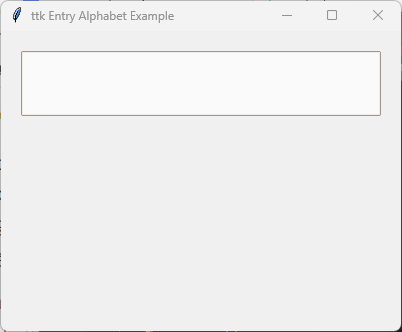
'''
import tkinter as tk
from tkinter import ttk
# Create the main window
root = tk.Tk()
root.title("ttk Entry Alphabet Example")
root.geometry("400x300")

style = ttk.Style()
style.theme_use("clam")

style.configure("Task.TEntry",
                fieldbackground="#fafafa",
                foreground="#2f2f2f",
                )

entry = ttk.Entry(root, style="Task.TEntry", font=("Comic Sans MS", 16), justify="left", width=20)
entry.pack(padx=20, pady=20, ipady=5)

root.mainloop()
Tasks
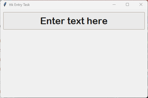
Create a Tkinter application with a window, "ttk Entry Task", size of 500x300, a ttk.Entry widget using the Arial Rounded MT Bold font, size 24, center-aligned text, and a width of 25 characters. Customize the theme layout background color to #eaeaea and the foreground color to #1f1f1f via a custom style class, displaying the widget inside the window using padding of 10 in both directions and internal y padding of 8.
- '''
'''
Create a Tkinter window with a themed entry widget. .. code-block:: python
import tkinter as tk from tkinter import ttk
# Create the main window root = tk.Tk() root.title("ttk Entry Task") root.geometry("500x300")
style = ttk.Style() style.theme_use("clam")
- style.configure("Task.TEntry",
fieldbackground="#eaeaea", foreground="#1f1f1f", )
# Create Entry widget applying a simple tuple font # Format: ("Family", Size, "Optional Styles") entry = ttk.Entry(root, font=("Arial Rounded MT Bold", 24),
style="Task.TEntry", justify="center", width=25)
entry.pack(padx=10, pady=10, ipady=8)
root.mainloop()
4.3. Option details
- entry_widget = ttk.Entry(parent, option=value)
- parent is the window or frame object.Options can be passed as parameters separated by commas.
Parameters:
- cursor
- Syntax:
entry_widget = ttk.Entry(parent, cursor="cursor_type")Description: Changes the cursor when hovering over the entry field area.Default:""Example:entry_widget = ttk.Entry(root, cursor="xterm")Possible values include:"arrow": Standard arrow cursor.
"xterm": I-beam cursor for text selection.
"hand2": Hand cursor.
"cross": Crosshair cursor.
"plus": Plus sign cursor.
"wait": Hourglass cursor.
- exportselection
- Syntax:
entry_widget = ttk.Entry(parent, exportselection=boolean)Description: Determines if selected text within the field is automatically copied to the clipboard.Default:1Example:entry_widget = ttk.Entry(root, exportselection=False)
- font
- Syntax:
entry_widget = ttk.Entry(parent, font=("font_name", size))Description: Sets the font family type and pixel size of the entry text.Default: System font configurationExample:entry_widget = ttk.Entry(root, font=("Arial", 12))
- justify
- Syntax:
entry_widget = ttk.Entry(parent, justify="alignment")Description: Specifies how the text is horizontally aligned within the input bounding box.Default:"left"Example:entry_widget = ttk.Entry(root, justify="center")Possible values include:"left": Aligns text to the left side.
"center": Centers text within the field width.
"right": Aligns text to the right side.
- show
- Syntax:
entry_widget = ttk.Entry(parent, show="character")Description: Masks visible input characters with a mask character, commonly used for hidden password values.Default:""Example:entry_widget = ttk.Entry(root, show="*")
- state
- Syntax:
entry_widget = ttk.Entry(parent, state="state")Description: Sets the user operational state of the input entry field.Default:"normal"Example:entry_widget = ttk.Entry(root, state="disabled")Possible values include:"normal": Full read/write behavior.
"disabled": Input box is greyed out and unselectable.
"readonly": Value is viewable and selectable but cannot be altered.
- style
- Syntax:
entry_widget = ttk.Entry(parent, style="StyleName")Description: Instructs the widget to extract thematic rules from a predefinedttk.Style()custom class layout signature (e.g., targeting"TEntry"configurations).Default:""Example:entry_widget = ttk.Entry(root, style="Custom.TEntry")
- textvariable
- Syntax:
entry_widget = ttk.Entry(parent, textvariable=variable)Description: Links a core Tkinter storage object (typically aStringVar) with the text entry space, permitting programmatic context extraction and real-time synchronization.Default:NoneExample:entry_widget = ttk.Entry(root, textvariable=my_var)
- validate
- Syntax:
entry_widget = ttk.Entry(parent, validate="validation_type")Description: Sets the interactive validation mode rules to run before modifying or processing content strings.Default:"none"Example:entry_widget = ttk.Entry(root, validate="focusout")Possible values include:"none": Disables dynamic field validation checks.
"focus": Evaluates when the widget context gains or forfeits user tracking focus.
"focusin": Evaluates when selecting or tabbing into the entry text field.
"focusout": Evaluates when shifting selection outside the entry container.
"key": Evaluates dynamically on every keystroke input event.
- width
- Syntax:
entry_widget = ttk.Entry(parent, width=characters)Description: Sets the sizing layout of the input channel measured in uniform text characters wide.Default:20Example:entry_widget = ttk.Entry(root, width=30)
Theme Configuration Attributes (via style.configure / style.map):
- fieldbackground
- Layout Syntax:
style.configure("TEntry", fieldbackground="color")Description: Sets the interior canvas color behind the text strings.Example:style.configure("Custom.TEntry", fieldbackground="#fafafa")
- foreground
- Layout Syntax:
style.configure("TEntry", foreground="color")Description: Configures the rendering color layer applied directly to text glyph lines.Example:style.configure("Custom.TEntry", foreground="#2f2f2f")