4. tk Checkbutton
4.1. Usage
The tkinter.Checkbutton widget provides a checkbutton (checkbox).
To create a checkbutton widget, the general syntax is (assuming import via "import tkinter as tk"):
- checkbutton_widget = tk.Checkbutton(parent, option=value)
- parent is the window or frame object.Options can be passed as parameters separated by commas.Each checkbutton has its own
IntVarbecause every checkbox stores its own checked state independently.Unlike radio buttons, checkbuttons should not share the same control variable.
4.2. Using check buttons
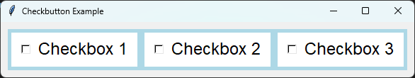
import tkinter as tk

# Create the main window
root = tk.Tk()
root.title("Checkbutton Example")

# Create a frame with a background color
frame1 = tk.Frame(root, bg="light blue")
frame1.pack(anchor="nw", padx=10, pady=10)

# Define a font style
font_style = ("Lucida Grande", 18)

# Define the options for group 1
options_grp1 = ["Checkbox 1", "Checkbox 2", "Checkbox 3"]
# Store each checkbox's IntVar using its label as the key.
variables = {}

for option in options_grp1:
    # Each checkbutton has its own IntVar.
    # IntVar() defaults to 0 (unchecked).
    variables[option] = tk.IntVar()

    # Make the first checkbutton checked initially.
    if option == "Checkbox 1":
        variables[option].set(1)

    button = tk.Checkbutton(
        frame1, text=option, variable=variables[option], indicatoron=1,
        bg="white", fg="black", font=font_style, padx=10, pady=5
    )
    button.pack(anchor="nw", padx=5, pady=5)

# Run the main event loop
root.mainloop()
Tasks
Modify the code so that it displays four checkbuttons arranged vertically.
Modify the code so that it displays four checkbuttons arranged vertically.
import tkinter as tk

# Create the main window
root = tk.Tk()
root.title("Checkbutton Question")
# Set the size of the window
root.geometry("350x300")

# Create a frame with a background color
frame1 = tk.Frame(root, bg="light blue")
frame1.pack(anchor="nw", padx=10, pady=10)

# Define a font style
font_style = ("Lucida Grande", 18)

# Define the options for group 1
options_grp1 = ["Checkbox 1", "Checkbox 2", "Checkbox 3", "Checkbox 4"]
# Store each checkbox's IntVar using its label as the key.
variables = {}

for option in options_grp1:
    # Each checkbutton has its own IntVar.
    # IntVar() defaults to 0 (unchecked).
    variables[option] = tk.IntVar()

    # Make the first checkbutton checked initially.
    if option == "Checkbox 1":
        variables[option].set(1)

    button = tk.Checkbutton(
        frame1, text=option, variable=variables[option], indicatoron=1,
        bg="white", fg="black", font=font_style, padx=10, pady=5
    )
    button.pack(anchor="w", padx=5, pady=5)    # defaults to side="top"


# Run the main event loop
root.mainloop()
4.3. Methods
- checkbutton_widget.select()
- Selects the checkbutton.Sets the associated control variable to the
onvalue.
- checkbutton_widget.deselect()
- Deselects the checkbutton.Sets the associated control variable to the
offvalue.
- checkbutton_widget.toggle()
- Toggles the state of the checkbutton.If the checkbutton is selected it becomes deselected, and vice versa.
- checkbutton_widget.flash()
- Briefly flashes the checkbutton several times.Useful for drawing the user's attention to the widget.
- checkbutton_widget.invoke()
- Simulates the user clicking the checkbutton.Toggles the state and calls the function specified by the
commandoption, if one exists.Returns the value returned by the callback function.
4.4. Control variable methods
- variable.get()
- Returns the current value of the associated control variable.
- variable.set(value)
- Sets the value of the associated control variable.If
valueequals theonvalue, the checkbutton becomes selected.Ifvalueequals theoffvalue, the checkbutton becomes deselected.
4.5. Parameter syntax
- checkbutton_widget = tk.Checkbutton(parent, option=value)
- parent is the window or frame object.Options can be passed as parameters separated by commas.
Parameters:
- activebackground
- Syntax:
checkbutton_widget = tk.Checkbutton(parent, activebackground="color")Description: Sets the background color of the checkbutton when it is active.Default: SystemButtonFaceExample:checkbutton_widget = tk.Checkbutton(root, activebackground="lightblue")
- activeforeground
- Syntax:
checkbutton_widget = tk.Checkbutton(parent, activeforeground="color")Description: Sets the foreground color of the checkbutton when it is active.Default: SystemWindowTextExample:checkbutton_widget = tk.Checkbutton(root, activeforeground="blue")
- anchor
- Syntax:
checkbutton_widget = tk.Checkbutton(parent, anchor="position")Description: Sets the anchor position for the text and indicator.Default: centerExample:checkbutton_widget = tk.Checkbutton(root, anchor="w")
- background
- bg
- Syntax:
checkbutton_widget = tk.Checkbutton(parent, background="color")Description: Sets the background color of the checkbutton.Default: SystemButtonFaceExample:checkbutton_widget = tk.Checkbutton(root, background="lightyellow")
- bd
- Syntax:
checkbutton_widget = tk.Checkbutton(parent, bd=border_width)Description: Sets the border width of the checkbutton.Default: 2Example:checkbutton_widget = tk.Checkbutton(root, bd=5)
- bitmap
- Syntax:
checkbutton_widget = tk.Checkbutton(parent, bitmap="bitmap_name")Description: Sets a bitmap image to be displayed on the checkbutton.Default: NoneExample:checkbutton_widget = tk.Checkbutton(root, bitmap="error")
- borderwidth
- Syntax:
checkbutton_widget = tk.Checkbutton(parent, borderwidth=width)Description: Sets the width of the border around the checkbutton.Default: 2Example:checkbutton_widget = tk.Checkbutton(root, borderwidth=3)
- command
- Syntax:
checkbutton_widget = tk.Checkbutton(parent, command=function)Description: Specifies a function to be called when the checkbutton is toggled.Default: NoneExample:checkbutton_widget = tk.Checkbutton(root, command=my_function)
- compound
- Syntax:
checkbutton_widget = tk.Checkbutton(parent, compound="position")Description: Specifies how to display the image and text (if both are set).Default: noneExample:checkbutton_widget = tk.Checkbutton(root, compound="left")
- cursor
- Syntax:
checkbutton_widget = tk.Checkbutton(parent, cursor="cursor_type")Description: Sets the mouse cursor when hovering over the checkbutton.Default: arrowExample:checkbutton_widget = tk.Checkbutton(root, cursor="hand2")
- disabledforeground
- Syntax:
checkbutton_widget = tk.Checkbutton(parent, disabledforeground="color")Description: Sets the foreground color when the checkbutton is disabled.Default: SystemDisabledTextExample:checkbutton_widget = tk.Checkbutton(root, disabledforeground="gray")
- foreground
- fg
- Syntax:
checkbutton_widget = tk.Checkbutton(parent, fg="color")Description: Sets the foreground color of the checkbutton (text color).Default: SystemWindowTextExample:checkbutton_widget = tk.Checkbutton(root, fg="black")
- font
- Syntax:
checkbutton_widget = tk.Checkbutton(parent, font=("font_name", size, "style"))Description: Specifies the font type, size, and style for the text of the checkbutton.Default: TkDefaultFontExample:checkbutton_widget = tk.Checkbutton(root, font=("Arial", 12, "bold"))
- height
- Syntax:
checkbutton_widget = tk.Checkbutton(parent, height=value)Description: Sets the height of the checkbutton.Default: 0 (automatically determined)Example:checkbutton_widget = tk.Checkbutton(root, height=2)
- highlightbackground
- Syntax:
checkbutton_widget = tk.Checkbutton(parent, highlightbackground="color")Description: Sets the background color of the checkbutton when it does not have focus.Default: SystemButtonFaceExample:checkbutton_widget = tk.Checkbutton(root, highlightbackground="gray")
- highlightcolor
- Syntax:
checkbutton_widget = tk.Checkbutton(parent, highlightcolor="color")Description: Sets the color of the highlight when the checkbutton has focus.Default: SystemWindowFrameExample:checkbutton_widget = tk.Checkbutton(root, highlightcolor="blue")
- highlightthickness
- Syntax:
checkbutton_widget = tk.Checkbutton(parent, highlightthickness=thickness)Description: Sets the thickness of the highlight border.Default: 1Example:checkbutton_widget = tk.Checkbutton(root, highlightthickness=2)
- image
- Syntax:
checkbutton_widget = tk.Checkbutton(parent, image="image_name")Description: Sets an image to be displayed on the checkbutton.Default: NoneExample:checkbutton_widget = tk.Checkbutton(root, image=my_image)
- indicatoron
- Syntax:
checkbutton_widget = tk.Checkbutton(parent, indicatoron=1)Description: Displays a traditional checkbox when set to 1. Set to 0 to display the widget as a regular toggle button.Setindicatoron=1to display a traditional checkbox.Setindicatoron=0to make the checkbutton appear as a regular button that stays pressed when selected.Default: 1Example:checkbutton_widget = tk.Checkbutton(root, indicatoron=0)
- justify
- Syntax:
checkbutton_widget = tk.Checkbutton(parent, justify="position")Description: Sets the justification of the text (left, center, right).Default: centerExample:checkbutton_widget = tk.Checkbutton(root, justify="right")
- offrelief
- Syntax:
checkbutton_widget = tk.Checkbutton(parent, offrelief="style")Description: Sets the relief style for the indicator when off.Default: raisedExample:checkbutton_widget = tk.Checkbutton(root, offrelief="flat")
- offvalue
- Syntax:
checkbutton_widget = tk.Checkbutton(parent, offvalue=value)Description: Sets the value associated with the checkbutton when it is not checked.Default: 0Example:checkbutton_widget = tk.Checkbutton(root, offvalue=0)
- onvalue
- Syntax:
checkbutton_widget = tk.Checkbutton(parent, onvalue=value)Description: Sets the value associated with the checkbutton when it is checked.Default: 1Example:checkbutton_widget = tk.Checkbutton(root, onvalue=1)
- overrelief
- Syntax:
checkbutton_widget = tk.Checkbutton(parent, overrelief="style")Description: Sets the relief style for the indicator when hovered over.Default: NoneExample:checkbutton_widget = tk.Checkbutton(root, overrelief="sunken")
- padx
- Syntax:
checkbutton_widget = tk.Checkbutton(parent, padx=padding_value)Description: Sets the horizontal padding within the checkbutton.Default: 1Example:checkbutton_widget = tk.Checkbutton(root, padx=10)
- pady
- Syntax:
checkbutton_widget = tk.Checkbutton(parent, pady=padding_value)Description: Sets the vertical padding within the checkbutton.Default: 1Example:checkbutton_widget = tk.Checkbutton(root, pady=10)
- relief
- Syntax:
checkbutton_widget = tk.Checkbutton(parent, relief="style")Description: Sets the border style of the checkbutton. Options include flat, raised, sunken, groove, ridge.Default: flatExample:checkbutton_widget = tk.Checkbutton(root, relief="raised")
- selectcolor
- Syntax:
checkbutton_widget = tk.Checkbutton(parent, selectcolor="color")Description: Sets the color of the indicator when the checkbutton is selected.Default: SystemWindowExample:checkbutton_widget = tk.Checkbutton(root, selectcolor="lightgreen")
- selectimage
- Syntax:
checkbutton_widget = tk.Checkbutton(parent, selectimage="image_name")Description: Sets an image to be displayed when the checkbutton is selected.Default: NoneExample:checkbutton_widget = tk.Checkbutton(root, selectimage=my_selected_image)
- state
- Syntax:
checkbutton_widget = tk.Checkbutton(parent, state="state_type")Description: Sets the state of the checkbutton. Options include normal or disabled.Default: normalExample:checkbutton_widget = tk.Checkbutton(root, state="disabled")
- takefocus
- Syntax:
checkbutton_widget = tk.Checkbutton(parent, takefocus=1)Description: Allows the checkbutton to receive keyboard focus using the Tab key.Default: NoneExample:checkbutton_widget = tk.Checkbutton(root, takefocus=1)
- text
- Syntax:
checkbutton_widget = tk.Checkbutton(parent, text="label")Description: Sets the text label for the checkbutton.Default: NoneExample:checkbutton_widget = tk.Checkbutton(root, text="Option 1")
- textvariable
- Syntax:
checkbutton_widget = tk.Checkbutton(parent, textvariable=variable)Description: Associates a variable with the text of the checkbutton.Default: NoneExample:checkbutton_widget = tk.Checkbutton(root, textvariable=my_text_var)
- tristateimage
- Syntax:
checkbutton_widget = tk.Checkbutton(parent, tristateimage="image_name")Description: Sets an image to be displayed when the checkbutton is in a tri-state mode.Default: NoneExample:checkbutton_widget = tk.Checkbutton(root, tristateimage=my_tristate_image)
- tristatevalue
- Syntax:
checkbutton_widget = tk.Checkbutton(parent, tristatevalue=value)Description: Sets the value associated with the checkbutton in a tri-state mode.Default: NoneExample:checkbutton_widget = tk.Checkbutton(root, tristatevalue=2)
- underline
- Syntax:
checkbutton_widget = tk.Checkbutton(parent, underline=index)Description: Specifies the index of the character to underline in the text.Default: -1 (no underline)Example:checkbutton_widget = tk.Checkbutton(root, underline=0)
- variable
- Syntax:
checkbutton_widget = tk.Checkbutton(parent, variable=control_variable)Description: Associates the checkbutton with a control variable (e.g., IntVar, StringVar).Default: An internal Tcl variable created automatically.Example:checkbutton_widget = tk.Checkbutton(root, variable=my_var)
- width
- Syntax:
checkbutton_widget = tk.Checkbutton(parent, width=width_value)Description: Sets the width of the checkbutton.Default: 0 (automatically determined)Example:checkbutton_widget = tk.Checkbutton(root, width=30)
- wraplength
- Syntax:
checkbutton_widget = tk.Checkbutton(parent, wraplength=length)Description: Sets the line length for text wrapping in the checkbutton.Default: 0 (no wrapping)Example:checkbutton_widget = tk.Checkbutton(root, wraplength=100)
4.6. Default options
Code to display the default value for each
Checkbutton option is shown below.import tkinter as tk
root = tk.Tk()
widget = tk.Checkbutton(root)
widget_options = widget.keys()
for option in widget_options:
print(f"{option}: {widget.cget(option)}") # cget retrieves the current value of the option