5. tk Entry
5.1. Usage
- entry_widget = tk.Entry(parent, option=value)
- parent is the window or frame object.Options can be passed as parameters separated by commas.The Entry widget is initially empty.
5.2. Entry example

import tkinter as tk

# Create the main window
root = tk.Tk()
root.geometry("500x300")  # Set window size
root.title("Entry Example")  # Set window title


# Create the entry widget for input
name_entry = tk.Entry(root, font=('Arial', 24), width=20)
name_entry.pack(pady=20)  # Add some padding to the top

# Run the main event loop
root.mainloop()
Tasks
Create a Tkinter application with a window size of 400x300, an Entry widget using the Comic Sans MS font size 20, a background color of #fafafa, a foreground color of #2f2f2f, a borderwidth of 2 with a sunken relief style, left-aligned text, and a width of 20 characters, with the widget displayed inside the window using padding of 20 in both directions and internal y padding of 5.

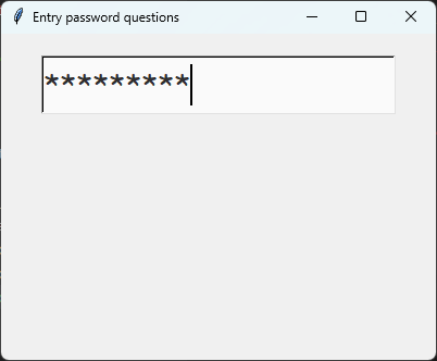
Create a Tkinter application with a window size of 400x300 containing a password Entry widget. Use the Comic Sans MS font size 20, a background color of #fafafa, a foreground color of #2f2f2f, a borderwidth of 2 with a sunken relief style, left-aligned text, a width of 20 characters, and display * characters instead of the typed password. Display the widget with padding of 20 in both directions and internal y padding of 5.
Create a Tkinter window with an entry widget.
import tkinter as tk

# Create the main window
root = tk.Tk()
root.title("Entry Alphabet Example")
root.geometry("400x300")

# Define the custom font
custom_font=("Comic Sans MS", 20)

# First Entry widget
entry = tk.Entry(
    root,
    font=custom_font,
    bg="#fafafa",
    fg="#2f2f2f",
    borderwidth=2,
    relief="sunken",
    justify="left",
    width=20
)
entry.pack(padx=20, pady=20, ipady=5)

# Run the Tkinter event loop
root.mainloop()
Create a Tkinter window with a password Entry widget.
import tkinter as tk

# Create the main window
root = tk.Tk()
root.title("Password Entry Example")
root.geometry("400x300")

# Define the custom font
custom_font = ("Comic Sans MS", 20)

# Create the password Entry widget
entry = tk.Entry(
    root,
    font=custom_font,
    bg="#fafafa",
    fg="#2f2f2f",
    borderwidth=2,
    relief="sunken",
    justify="left",
    width=20,
    show="*"
)
entry.pack(padx=20, pady=20, ipady=5)

# Run the Tkinter event loop
root.mainloop()
5.3. Entry methods
text = entry_widget.get().entry_widget.delete(0, tk.END).entry_widget.insert(0, "text").entry_widget.focus_set().entry_widget.select_range(0, tk.END).- text = entry_widget.get()
- Retrieves the current text from the Entry widget.Returns the text as a string.
- entry_widget.delete(first, last=None)
- Deletes characters from the Entry widget.Use
entry_widget.delete(0, tk.END)to clear all text.
- entry_widget.insert(index, text)
- Inserts
textat the specifiedindex.Useentry_widget.insert(0, "text")to insert text at the beginning.
- entry_widget.focus_set()
- Gives the Entry widget keyboard focus.The insertion cursor is placed in the widget ready for typing.
- entry_widget.select_range(start, end)
- Selects the text between
startandend.Useentry_widget.select_range(0, tk.END)to select all text.
5.4. Option details
- entry_widget = tk.Entry(parent, option=value)
- parent is the window or frame object.Options can be passed as parameters separated by commas.
Parameters:
- background
- bg
- Syntax:
entry_widget = tk.Entry(parent, bg="color")Description: Sets the background color of the entry field.Default: SystemWindow RGB: (255, 255, 255)Example:entry_widget = tk.Entry(root, bg="lightgrey")
- bd
- borderwidth
- Syntax:
entry_widget = tk.Entry(parent, borderwidth=width)Description: Sets the width of the border around the entry field.Default:2Example:entry_widget = tk.Entry(root, borderwidth=5)
- cursor
- Syntax:
entry_widget = tk.Entry(parent, cursor="cursor_type")Description: Changes the cursor when hovering over the entry field.Default:NoneExample:entry_widget = tk.Entry(root, cursor="xterm")Possible values include:"arrow": Standard arrow cursor.
"xterm": I-beam cursor for text selection.
"hand2": Hand cursor.
"cross": Crosshair cursor.
"plus": Plus sign cursor.
"wait": Hourglass cursor.
- disabledbackground
- Syntax:
entry_widget = tk.Entry(parent, disabledbackground="color")Description: Sets the background color when the entry is disabled.Default: SystemDisabled RGB: (240, 240, 240)Example:entry_widget = tk.Entry(root, disabledbackground="lightgrey")
- disabledforeground
- Syntax:
entry_widget = tk.Entry(parent, disabledforeground="color")Description: Sets the text color when the entry is disabled.Default: SystemDisabledText RGB: (109, 109, 109)Example:entry_widget = tk.Entry(root, disabledforeground="darkgrey")
- exportselection
- Syntax:
entry_widget = tk.Entry(parent, exportselection=boolean)Description: Determines if the text selection is exported to the clipboard.Default:1Example:entry_widget = tk.Entry(root, exportselection=False)
- font
- Syntax:
entry_widget = tk.Entry(parent, font=("font_name", size))Description: Sets the font type and size of the entry text.Default: System font and sizeExample:entry_widget = tk.Entry(root, font=("Arial", 12))
- foreground
- fg
- Syntax:
entry_widget = tk.Entry(parent, fg="color")Description: Sets the text color of the entry field.Default: SystemWindowText RGB: (0, 0, 0)Example:entry_widget = tk.Entry(root, fg="blue")
- highlightbackground
- Syntax:
entry_widget = tk.Entry(parent, highlightbackground="color")Description: Sets the color of the highlight when the entry does not have focus.Default: SystemButtonFace RGB: (240, 240, 240)Example:entry_widget = tk.Entry(root, highlightbackground="grey")
- highlightcolor
- Syntax:
entry_widget = tk.Entry(parent, highlightcolor="color")Description: Sets the color of the highlight when the entry has focus.Default: SystemHighlight RGB: (100, 100, 100)Example:entry_widget = tk.Entry(root, highlightcolor="blue")
- highlightthickness
- Syntax:
entry_widget = tk.Entry(parent, highlightthickness=thickness)Description: Sets the thickness of the focus highlight border.Default:1Example:entry_widget = tk.Entry(root, highlightthickness=2)
- insertbackground
- Syntax:
entry_widget = tk.Entry(parent, insertbackground="color")Description: Sets the color of the insertion cursor (caret).Default: SystemWindowText RGB: (0, 0, 0)Example:entry_widget = tk.Entry(root, insertbackground="red")
- insertborderwidth
- Syntax:
entry_widget = tk.Entry(parent, insertborderwidth=width)Description: Sets the width of the insertion cursor's border.Default:0Example:entry_widget = tk.Entry(root, insertborderwidth=1)
- insertofftime
- Syntax:
entry_widget = tk.Entry(parent, insertofftime=milliseconds)Description: Sets the time the insertion cursor is off per blink in milliseconds.Default:300Example:entry_widget = tk.Entry(root, insertofftime=500)
- insertontime
- Syntax:
entry_widget = tk.Entry(parent, insertontime=milliseconds)Description: Sets the time the insertion cursor is on per blink in milliseconds.Default:600Example:entry_widget = tk.Entry(root, insertontime=500)
- insertwidth
- Syntax:
entry_widget = tk.Entry(parent, insertwidth=width)Description: Sets the width of the insertion cursor.Default:2Example:entry_widget = tk.Entry(root, insertwidth=3)
- justify
- Syntax:
entry_widget = tk.Entry(parent, justify="alignment")Description: Specifies how the text is aligned within the entry field.It doesn't change where insertion starts.Default:leftExample:entry_widget = tk.Entry(root, justify="center")Possible values include:"left": Aligns text to the left.
"center": Centers text within the field.
"right": Aligns text to the right.
- relief
- Syntax:
entry_widget = tk.Entry(parent, relief="relief_type")Description: Sets the border style of the entry field.Default:flatExample:entry_widget = tk.Entry(root, relief="sunken")Possible values include:"flat"
"raised"
"sunken"
"groove"
"ridge"
"solid"
- show
- Syntax:
entry_widget = tk.Entry(parent, show="character")Description: Masks characters, often used for passwords.Default:""Example:entry_widget = tk.Entry(root, show="*")
- state
- Syntax:
entry_widget = tk.Entry(parent, state="state")Description: Sets the state of the entry field.Default:normalExample:entry_widget = tk.Entry(root, state="disabled")Possible values include:"normal"
"disabled"
"readonly"
- takefocus
- Syntax:
entry_widget = tk.Entry(parent, takefocus=boolean)Description: Determines if the entry field can receive focus via keyboard navigation.Default:1Example:entry_widget = tk.Entry(root, takefocus=False)
- textvariable
- Syntax:
entry_widget = tk.Entry(parent, textvariable=variable)Description: Associates a Tkinter variable (usually a StringVar) with the entry text.Default:NoneExample:entry_widget = tk.Entry(root, textvariable=my_var)
- validate
- Syntax:
entry_widget = tk.Entry(parent, validate="validation_type")Description: Sets the type of validation to apply to the entry field.Default:noneExample:entry_widget = tk.Entry(root, validate="focusout")Possible values include:"none": No validation.
"focus": Validation occurs when the widget gains or loses focus.
"focusin": Validation occurs when the entry gains focus.
"focusout": Validation occurs when the entry loses focus.
"key": Validation occurs on every keystroke.
"all": Validation occurs on every keystroke and when the entry loses or gains focus.
- width
- Syntax:
entry_widget = tk.Entry(parent, width=characters)Description: Sets the width of the entry field in characters.Default:20Example:entry_widget = tk.Entry(root, width=30)
- xscrollcommand
- Syntax:
entry_widget = tk.Entry(parent, xscrollcommand=scroll_function)Description: Specifies a function for horizontal scrolling.Default:NoneExample:entry_widget = tk.Entry(root, xscrollcommand=my_scroll_function)
5.5. Default options
Entry option is shown below.import tkinter as tk
root = tk.Tk()
widget = tk.Entry(root)
widget_options = widget.keys()
for option in widget_options:
print(f"{option}: {widget.cget(option)}") # cget retrieves the current value of the option