18. tk Text
18.1. Usage
The tkinter.Text widget provides a versatile multi-line text area that you can use for various purposes such as comments or descriptions
To create a multi-line text widget the general syntax is (assuming import via "import tkinter as tk"):
- text_widget = tk.Text(parent, option=value)
- parent is the window or frame object.Options can be passed as parameters separated by commas.
Options can also be changed or added anew after widget creation.
- text_widget.config(option=value)
- text_widget is the Text widget object.Options can be passed as parameters separated by commas.
18.2. Text widget example

The code below sets some widget options at creation.
It also uses .config() to add other custom options.
import tkinter as tk


root = tk.Tk()
root.title("Text Widget Example")
root.geometry("300x200")

# Create a Text widget
text = tk.Text(root, height=6, width=40, wrap="word", font=("Arial", 12))
text.pack(padx=10, pady=10)

# Insert initial content
text.insert(
    "1.0", "Welcome to \nthe Text Widget!\nIt has multiline text.")

# Customize options
text.config(
    bg="#fafafa",  # Background color
    fg="blue",  # Text color
    borderwidth=1,  # Border width
    relief="solid",  # Border style
    insertbackground="red",  # Insertion cursor color
    selectbackground="red",   # Selection background color
    state="normal",  # Enable editing (use "disabled" to disable)
    padx=10,
    pady=10
)

root.mainloop()
Tasks
Modify the given Tkinter code to change the following options to use a background color of light yellow, a text color of dark green, a background selection color of purple, a border width of 2, a border style of "groove" and disabled state so it can't be edited.
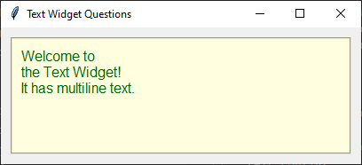
Modify the given Tkinter code to change the following options to use a background color of light yellow, a text color of dark green, a background selection color of purple, a border width of 2, a border style of "groove" and disabled state so it can't be edited.
import tkinter as tk

root = tk.Tk()
root.title("Text Widget Questions")

# Create a Text widget
text = tk.Text(root, height=6, width=40, wrap="word", font=("Arial", 12))
text.pack(padx=10, pady=10)

# Insert initial content
text.insert(
    "1.0", "Welcome to \nthe Text Widget!\nIt has multiline text.")

# Customize options
text.config(
    bg="light yellow",  # Background color
    fg="dark green",  # Text color
    borderwidth=2,  # Border width
    relief="groove",  # Border style
    insertbackground="red",  # Insertion cursor color
    selectbackground="purple",   # Selection background color
    state="disabled",  # Disable editing
    padx=10,
    pady=10
)

root.mainloop()
18.3. Methods
Insert text using
text_widget.insert("1.0", "text").Retrieve all text using
text = text_widget.get("1.0", tk.END).Delete all text using
text_widget.delete("1.0", tk.END).Scroll to the end using
text_widget.see(tk.END).Configure a tag for text using
text_widget.tag_configure("red", foreground="red").Text widget positions use the format "line.character".
For example, "1.0" is the first character on the first line.
The integer before the decimal represents the line number (1-indexed), and the integer after represents the character column (0-indexed).
- text_widget.tag_configure(tag_name, option=value)
- Configures the appearance of the specified text tag.Use
text_widget.tag_configure("red", foreground="red")to create a tag to be used to display tagged text in red.Multiple options can be specified, for exampletext_widget.tag_configure("heading", font=("Arial", 16, "bold"), foreground="red").
- text_widget.insert(index, text, *tags)
- Inserts
textat the specifiedindex.Usetext_widget.insert("1.0", "Hello")to insert text at the beginning of the Text widget.Usetext_widget.insert(tk.END, "Hello")to append text to the end of the existing text.*tagsare zero or more tag names to apply to the inserted text. For multiple tages, quote them as a tuple.Usetext_widget.insert(tk.END, "Error", "red")to insert text using theredtag.Ifindexis outside the valid range, Tk adjusts it to the nearest valid position.
- text_widget.get(start, end)
- Retrieves the text between
startandend.Usetext_widget.get("1.0", tk.END)to retrieve all text.
- text_widget.delete(start, end)
- Deletes the text between
startandend.Usetext_widget.delete("1.0", tk.END)to clear the widget.
- text_widget.see(index)
- Scrolls the Text widget so that the specified
indexis visible.Usetext_widget.see(tk.END)to scroll to the end of the text.Commonly used after inserting text so the most recently added text is visible.
18.4. Parameter syntax
- text_widget = tk.Text(parent, option=value)
Parameters:
- autoseparators
text_widget = tk.Text(parent, autoseparators=1)Description: Enables automatic separator insertion when typing.Default: 1Example:text_widget = tk.Text(root, autoseparators=1)
- background
- bg
text_widget = tk.Text(parent, background="color")Description: Sets the background color of the text widget.Default: SystemWindowExample:text_widget = tk.Text(root, background="lightyellow")
- borderwidth
- bd
text_widget = tk.Text(parent, borderwidth=border_width)Description: Sets the border width of the text widget.Default: 1Example:text_widget = tk.Text(root, borderwidth=2)
- blockcursor
text_widget = tk.Text(parent, blockcursor=0)Description: Sets the cursor style; a block or normal cursor.Default: 0Example:text_widget = tk.Text(root, blockcursor=1)
- cursor
text_widget = tk.Text(parent, cursor="cursor_type")Description: Sets the mouse cursor when hovering over the text widget.Default: xtermExample:text_widget = tk.Text(root, cursor="hand2")
- exportselection
text_widget = tk.Text(parent, exportselection=1)Description: Allows the text selection to be copied to the clipboard.Default: 1Example:text_widget = tk.Text(root, exportselection=1)
- font
text_widget = tk.Text(parent, font=("font_name", size, "style"))Description: Specifies the font type, size, and style for the text.Default: TkFixedFontExample:text_widget = tk.Text(root, font=("Arial", 12, "italic"))
- foreground
- fg
text_widget = tk.Text(parent, foreground="color")Description: Sets the foreground color (text color) of the text widget.Default: SystemWindowTextExample:text_widget = tk.Text(root, foreground="black")
- height
text_widget = tk.Text(parent, height=height_value)Description: Sets the height of the text widget in lines.Default: 24Example:text_widget = tk.Text(root, height=10)
- highlightbackground
text_widget = tk.Text(parent, highlightbackground="color")Description: Sets the background color when the text widget does not have focus.Default: SystemButtonFaceExample:text_widget = tk.Text(root, highlightbackground="gray")
- highlightcolor
text_widget = tk.Text(parent, highlightcolor="color")Description: Sets the color of the highlight when the text widget has focus.Default: SystemWindowFrameExample:text_widget = tk.Text(root, highlightcolor="blue")
- highlightthickness
text_widget = tk.Text(parent, highlightthickness=thickness)Description: Sets the thickness of the highlight border.Default: 0Example:text_widget = tk.Text(root, highlightthickness=2)
- inactiveselectbackground
text_widget = tk.Text(parent, inactiveselectbackground="color")Description: Sets the background color for selected text when the widget is inactive.Default: NoneExample:text_widget = tk.Text(root, inactiveselectbackground="lightgray")
- insertbackground
text_widget = tk.Text(parent, insertbackground="color")Description: Sets the color of the insertion cursor (caret).Default: SystemWindowTextExample:text_widget = tk.Text(root, insertbackground="red")
- insertborderwidth
text_widget = tk.Text(parent, insertborderwidth=width)Description: Sets the width of the border around the insertion cursor.Default: 0Example:text_widget = tk.Text(root, insertborderwidth=2)
- insertofftime
text_widget = tk.Text(parent, insertofftime=milliseconds)Description: Sets the time the cursor stays off (in milliseconds).Default: 300Example:text_widget = tk.Text(root, insertofftime=500)
- insertontime
text_widget = tk.Text(parent, insertontime=milliseconds)Description: Sets the time the cursor stays on (in milliseconds).Default: 600Example:text_widget = tk.Text(root, insertontime=800)
- insertunfocussed
text_widget = tk.Text(parent, insertunfocussed="style")Description: Sets the style of the cursor when the widget is unfocused.Default: noneExample:text_widget = tk.Text(root, insertunfocussed="underline")
- insertwidth
text_widget = tk.Text(parent, insertwidth=width)Description: Sets the width of the insertion cursor.Default: 2Example:text_widget = tk.Text(root, insertwidth=5)
- maxundo
text_widget = tk.Text(parent, maxundo=number)Description: Sets the maximum number of undo operations.Default: 0 (unlimited)Example:text_widget = tk.Text(root, maxundo=100)
- padx
text_widget = tk.Text(parent, padx=padding_value)Description: Sets the horizontal padding within the text widget.Default: 1Example:text_widget = tk.Text(root, padx=10)
- pady
text_widget = tk.Text(parent, pady=padding_value)Description: Sets the vertical padding within the text widget.Default: 1Example:text_widget = tk.Text(root, pady=10)
- relief
text_widget = tk.Text(parent, relief="style")Description: Sets the border style of the text widget. Options include flat, raised, sunken, groove, ridge.Default: sunkenExample:text_widget = tk.Text(root, relief="flat")
- selectbackground
text_widget = tk.Text(parent, selectbackground="color")Description: Sets the background color of the selected text.Default: SystemHighlightExample:text_widget = tk.Text(root, selectbackground="lightblue")
- selectborderwidth
text_widget = tk.Text(parent, selectborderwidth=width)Description: Sets the border width of the selection.Default: 0Example:text_widget = tk.Text(root, selectborderwidth=1)
- selectforeground
text_widget = tk.Text(parent, selectforeground="color")Description: Sets the text color of the selected text.Default: SystemHighlightTextExample:text_widget = tk.Text(root, selectforeground="white")
- setgrid
text_widget = tk.Text(parent, setgrid=0)Description: tells the window manager to resize the window in character-sized increments.Default: 0setgrid=0tells the window manager to resize the window in pixel-sized increments.Example:text_widget = tk.Text(root, setgrid=1)setgrid=1tells the window manager to resize the window in character-sized increments. This means that the window will snap to sizes that fit an integer number of characters, which is particularly useful for text editors where you want to ensure the window size accommodates full lines or rows of text.
- spacing1
text_widget = tk.Text(parent, spacing1=spacing_value)Description: Sets the spacing before paragraphs.Default: 0Example:text_widget = tk.Text(root, spacing1=5)
- spacing2
text_widget = tk.Text(parent, spacing2=spacing_value)Description: Sets the spacing between lines.Default: 0Example:text_widget = tk.Text(root, spacing2=3)
- spacing3
text_widget = tk.Text(parent, spacing3=spacing_value)Description: Sets the spacing after paragraphs.Default: 0Example:text_widget = tk.Text(root, spacing3=5)
- state
text_widget = tk.Text(parent, state="state_type")Description: Sets the state of the text widget. Options include normal or disabled.Default: normalExample:text_widget = tk.Text(root, state="disabled")
- tabs
text_widget = tk.Text(parent, tabs=tab_stops)Description: Sets tab stops for the text widget.Default: NoneExample:text_widget = tk.Text(root, tabs=4)
- tabstyle
text_widget = tk.Text(parent, tabstyle="style")Description: Specifies the style for tab stops. Options include tabular.Default: tabularExample:text_widget = tk.Text(root, tabstyle="tabular")
- takefocus
text_widget = tk.Text(parent, takefocus=1)Description: Allows the text widget to take focus on click.Default: NoneExample:text_widget = tk.Text(root, takefocus=1)
- undo
text_widget = tk.Text(parent, undo=0)Description: Enables the undo feature for the text widget.Default: 0Example:text_widget = tk.Text(root, undo=1)
- width
text_widget = tk.Text(parent, width=width_value)Description: Sets the width of the text widget in characters.Default: 80Example:text_widget = tk.Text(root, width=50)
- wrap
text_widget = tk.Text(parent, wrap="mode")Description: Sets the text wrapping mode. Options are none, char, or word.Default: charExample:text_widget = tk.Text(root, wrap="word")
- xscrollcommand
text_widget = tk.Text(parent, xscrollcommand=command)Description: Configures the command for horizontal scrolling.Default: NoneExample:text_widget = tk.Text(root, xscrollcommand=my_xscroll_command)
- yscrollcommand
text_widget = tk.Text(parent, yscrollcommand=command)Description: Configures the command for vertical scrolling.Default: NoneExample:text_widget = tk.Text(root, yscrollcommand=my_yscroll_command)
18.5. Default options
Code to display the default value for each
Text option is shown below.import tkinter as tk
root = tk.Tk()
widget = tk.Text(root)
widget_options = widget.keys()
for option in widget_options:
print(f"{option}: {widget.cget(option)}") # cget retrieves the current value of the option