14. tk Radiobutton
14.1. Usage
The tkinter.Radiobutton widget provides a radio button that allows the user to select one option from a group of choices.
To create a Radio button widget the general syntax is
(assuming import via "import tkinter as tk"):
- radiobutton_widget = tk.Radiobutton(parent, option=value)
- parent is the window or frame object.Options can be passed as parameters separated by commas.Each radio button should have a unique
value.When the button is selected, this value is stored in the sharedvariable.
14.2. Using radio buttons
This code creates one group of radio buttons in a frame and a second group in root window below the frame.
Each radio button in a group has its own
value.All radio buttons in the group share the same
variable.Selecting a radio button stores its
value in the shared variable.To group radio buttons together, set the variable option to the same StringVar (or IntVar) for each radio button. e.g.
variable=option_grp1_var.A
StringVar is commonly used when the radio button values are strings.An
IntVar is commonly used when the values are integers.All radio buttons in the group must share the same control variable so only one option can be selected at a time.
To preselect the first radio button in the group use:
option_grp1_var.set("Option 1").Set the indicatoron option to 0, to display the widget as a regular push button instead of a circular radio button.
Set the indicatoron option to 1, to make the radio buttons look like radio buttons.
A for loop is used to create each group of radio buttons since they have the same formatting options apart from the text and value options which are taken care of by the loop variable, option.
import tkinter as tk
from tkinter import font
# Create the main window
root = tk.Tk()
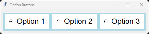
root.title("Option Buttons")
# Create a frame with a background color
frame = tk.Frame(root, bg="light blue")
frame.pack(anchor="nw", padx=10, pady=10)
# Define a font style
font_style = ("Lucida Grande", 18)
# Create a StringVar to hold the selected option
option_grp1_var = tk.StringVar(value="Option 1") # Set a default value for the variable
# Define the options
options_grp1 = ["Option 1", "Option 2", "Option 3"]
# Create and pack the radio buttons
for option in options_grp1:
button = tk.Radiobutton(frame, text=option, value=option, variable=option_grp1_var,
bg="white", fg="black", font=font_style,
indicatoron=1, padx=10, pady=5)
button.pack(anchor="nw", side="left", padx=5, pady=5)
# Run the main event loop
root.mainloop()
Tasks
Modify the code to display four radio buttons vertically, one beneath the other.

Modify the code to display four radio buttons vertically, one beneath the other.
import tkinter as tk
from tkinter import font

# Create the main window
root = tk.Tk()
root.title("Radio Buttons Question")
root.geometry("300x300")

# Create a frame with a background color
frame = tk.Frame(root, bg="light blue")
frame.pack(anchor="nw", padx=10, pady=10)

# Define a font style
font_style = ("Lucida Grande", 18)

# Create a StringVar to hold the selected option
option_var = tk.StringVar(value="Option 1")  # set a default value

# Define the options
options = ["Option 1", "Option 2", "Option 3", "Option 4"]

# Create and pack the radio buttons
for option in options:
    button = tk.Radiobutton(frame, text=option, value=option, variable=option_var,
                            bg="white", fg="black", font=font_style,
                            indicatoron=1, padx=10, pady=5)
    button.pack(anchor="nw", side="top", padx=5, pady=5)

# Run the main event loop
root.mainloop()
14.3. Methods
- radiobutton_widget.select()
- Selects the radiobutton.Sets the associated control variable to this radiobutton's
value.
- radiobutton_widget.deselect()
- Deselects the radiobutton.Sets the associated control variable to an empty value.This is mainly useful when no radiobutton in the group should be selected.
- radiobutton_widget.flash()
- Briefly flashes the radiobutton several times.Useful for drawing the user's attention to the widget.
- radiobutton_widget.invoke()
- Simulates the user selecting the radiobutton.Sets the associated control variable to the radiobutton's
valueand calls the function specified by thecommandoption, if one exists.Returns the value returned by the callback function.
- radiobutton_widget.config(option=value)
- Changes one or more widget options after creation.
14.4. Control variable methods
- variable.get()
- Returns the currently selected value.
- variable.set(value)
- Selects the radiobutton whose
valuematchesvalue.If no radiobutton has a matching value, none of the radiobuttons are selected.
14.5. Parameter syntax
- radiobutton_widget = tk.Radiobutton(parent, option=value)
- parent is the window or frame object.Options can be passed as parameters separated by commas.
Parameters:
- activebackground
- Syntax:
radiobutton_widget = tk.Radiobutton(parent, activebackground="color")Description: Sets the background color of the radiobutton when it is active.Default: SystemButtonFaceExample:radiobutton_widget = tk.Radiobutton(root, activebackground="lightblue")
- activeforeground
- Syntax:
radiobutton_widget = tk.Radiobutton(parent, activeforeground="color")Description: Sets the foreground color of the radiobutton when it is active.Default: SystemWindowTextExample:radiobutton_widget = tk.Radiobutton(root, activeforeground="blue")
- anchor
- Syntax:
radiobutton_widget = tk.Radiobutton(parent, anchor="position")Description: Sets the anchor position for the text and indicator.Default: centerExample:radiobutton_widget = tk.Radiobutton(root, anchor="w")
- background
- Syntax:
radiobutton_widget = tk.Radiobutton(parent, background="color")Description: Sets the background color of the radiobutton.Default: SystemButtonFaceExample:radiobutton_widget = tk.Radiobutton(root, background="lightyellow")
- bd
- Syntax:
radiobutton_widget = tk.Radiobutton(parent, bd=border_width)Description: Sets the border width of the radiobutton.Default: 2Example:radiobutton_widget = tk.Radiobutton(root, bd=5)
- bg
- Syntax:
radiobutton_widget = tk.Radiobutton(parent, bg="color")Description: Sets the background color of the radiobutton.Default: SystemButtonFaceExample:radiobutton_widget = tk.Radiobutton(root, bg="lightyellow")
- bitmap
- Syntax:
radiobutton_widget = tk.Radiobutton(parent, bitmap="bitmap_name")Description: Sets a bitmap image to be displayed on the radiobutton.Default: NoneExample:radiobutton_widget = tk.Radiobutton(root, bitmap="error")
- borderwidth
- Syntax:
radiobutton_widget = tk.Radiobutton(parent, borderwidth=width)Description: Sets the width of the border around the radiobutton.Default: 2Example:radiobutton_widget = tk.Radiobutton(root, borderwidth=3)
- command
- Syntax:
radiobutton_widget = tk.Radiobutton(parent, command=function)Description: Specifies a function to be called when the radiobutton is selected. Do not include parentheses after the function name.Default: NoneExample:radiobutton_widget = tk.Radiobutton(root, command=my_function)
- compound
- Syntax:
radiobutton_widget = tk.Radiobutton(parent, compound="position")Description: Specifies how to display the image and text (if both are set).Default: noneExample:radiobutton_widget = tk.Radiobutton(root, compound="left")
- cursor
- Syntax:
radiobutton_widget = tk.Radiobutton(parent, cursor="cursor_type")Description: Sets the mouse cursor when hovering over the radiobutton.Default: arrowExample:radiobutton_widget = tk.Radiobutton(root, cursor="hand2")
- disabledforeground
- Syntax:
radiobutton_widget = tk.Radiobutton(parent, disabledforeground="color")Description: Sets the foreground color when the radiobutton is disabled.Default: SystemDisabledTextExample:radiobutton_widget = tk.Radiobutton(root, disabledforeground="gray")
- fg
- Syntax:
radiobutton_widget = tk.Radiobutton(parent, fg="color")Description: Sets the foreground color of the radiobutton (text color).Default: SystemWindowTextExample:radiobutton_widget = tk.Radiobutton(root, fg="black")
- font
- Syntax:
radiobutton_widget = tk.Radiobutton(parent, font=("font_name", size, "style"))Description: Specifies the font type, size, and style for the text of the radiobutton.Default: TkDefaultFontExample:radiobutton_widget = tk.Radiobutton(root, font=("Arial", 12, "bold"))
- foreground
- Syntax:
radiobutton_widget = tk.Radiobutton(parent, foreground="color")Description: Sets the foreground color of the radiobutton (text color).Default: SystemWindowTextExample:radiobutton_widget = tk.Radiobutton(root, foreground="black")
- height
- Syntax:
radiobutton_widget = tk.Radiobutton(parent, height=value)Description: Sets the height of the radiobutton.Default: 0 (automatically determined)Example:radiobutton_widget = tk.Radiobutton(root, height=2)
- highlightbackground
- Syntax:
radiobutton_widget = tk.Radiobutton(parent, highlightbackground="color")Description: Sets the background color of the radiobutton when it does not have focus.Default: SystemButtonFaceExample:radiobutton_widget = tk.Radiobutton(root, highlightbackground="gray")
- highlightcolor
- Syntax:
radiobutton_widget = tk.Radiobutton(parent, highlightcolor="color")Description: Sets the color of the highlight when the radiobutton has focus.Default: SystemWindowFrameExample:radiobutton_widget = tk.Radiobutton(root, highlightcolor="blue")
- highlightthickness
- Syntax:
radiobutton_widget = tk.Radiobutton(parent, highlightthickness=thickness)Description: Sets the thickness of the highlight border.Default: 1Example:radiobutton_widget = tk.Radiobutton(root, highlightthickness=2)
- image
- Syntax:
radiobutton_widget = tk.Radiobutton(parent, image="image_name")Description: Sets an image to be displayed on the radiobutton.Default: NoneExample:radiobutton_widget = tk.Radiobutton(root, image=my_image)
- indicatoron
- Syntax:
radiobutton_widget = tk.Radiobutton(parent, indicatoron=1)Description: Determines whether the circular radio button indicator is shown. Set to 0 to display the widget as a push button.Default: 1Example:radiobutton_widget = tk.Radiobutton(root, indicatoron=0)
- justify
- Syntax:
radiobutton_widget = tk.Radiobutton(parent, justify="position")Description: Sets the justification of the text (left, center, right).Default: centerExample:radiobutton_widget = tk.Radiobutton(root, justify="right")
- offrelief
- Syntax:
radiobutton_widget = tk.Radiobutton(parent, offrelief="style")Description: Sets the relief style for the indicator when off.Default: raisedExample:radiobutton_widget = tk.Radiobutton(root, offrelief="flat")
- overrelief
- Syntax:
radiobutton_widget = tk.Radiobutton(parent, overrelief="style")Description: Sets the relief style for the indicator when hovered over.Default: NoneExample:radiobutton_widget = tk.Radiobutton(root, overrelief="sunken")
- padx
- Syntax:
radiobutton_widget = tk.Radiobutton(parent, padx=padding_value)Description: Sets the horizontal padding within the radiobutton.Default: 1Example:radiobutton_widget = tk.Radiobutton(root, padx=10)
- pady
- Syntax:
radiobutton_widget = tk.Radiobutton(parent, pady=padding_value)Description: Sets the vertical padding within the radiobutton.Default: 1Example:radiobutton_widget = tk.Radiobutton(root, pady=10)
- relief
- Syntax:
radiobutton_widget = tk.Radiobutton(parent, relief="style")Description: Sets the border style of the radiobutton. Options include flat, raised, sunken, groove, ridge.Default: flatExample:radiobutton_widget = tk.Radiobutton(root, relief="raised")
- selectcolor
- Syntax:
radiobutton_widget = tk.Radiobutton(parent, selectcolor="color")Description: Sets the color of the indicator when the radiobutton is selected.Default: SystemWindowExample:radiobutton_widget = tk.Radiobutton(root, selectcolor="lightgreen")
- selectimage
- Syntax:
radiobutton_widget = tk.Radiobutton(parent, selectimage="image_name")Description: Sets an image to be displayed when the radiobutton is selected.Default: NoneExample:radiobutton_widget = tk.Radiobutton(root, selectimage=my_selected_image)
- state
- Syntax:
radiobutton_widget = tk.Radiobutton(parent, state="state_type")Description: Sets the state of the radiobutton. Options include normal, disabled, or active.Default: normalExample:radiobutton_widget = tk.Radiobutton(root, state="disabled")
- takefocus
- Syntax:
radiobutton_widget = tk.Radiobutton(parent, takefocus=1)Description: Allows the radiobutton to take focus on click.Default: NoneExample:radiobutton_widget = tk.Radiobutton(root, takefocus=1)
- text
- Syntax:
radiobutton_widget = tk.Radiobutton(parent, text="label")Description: Sets the text label for the radiobutton.Default: NoneExample:radiobutton_widget = tk.Radiobutton(root, text="Option 1")
- textvariable
- Syntax:
radiobutton_widget = tk.Radiobutton(parent, textvariable=variable)Description: Associates a variable with the text of the radiobutton.Default: NoneExample:radiobutton_widget = tk.Radiobutton(root, textvariable=my_text_var)
- tristateimage
- Syntax:
radiobutton_widget = tk.Radiobutton(parent, tristateimage="image_name")Description: Sets an image to be displayed for a tristate radiobutton.Default: NoneExample:radiobutton_widget = tk.Radiobutton(root, tristateimage=my_tristate_image)
- tristatevalue
- Syntax:
radiobutton_widget = tk.Radiobutton(parent, tristatevalue=value)Description: Sets the value for the tristate option of the radiobutton.Default: NoneExample:radiobutton_widget = tk.Radiobutton(root, tristatevalue=2)
- underline
- Syntax:
radiobutton_widget = tk.Radiobutton(parent, underline=index)Description: Specifies the index of the character to underline in the text.Default: -1 (no underline)Example:radiobutton_widget = tk.Radiobutton(root, underline=0)
- value
- Syntax:
radiobutton_widget = tk.Radiobutton(parent, value=radio_value)Description: Specifies the value assigned to the shared control variable when this radio button is selected.Default: NoneExample:radiobutton_widget = tk.Radiobutton(root, value=1)
- variable
- Syntax:
radiobutton_widget = tk.Radiobutton(parent, variable=control_variable)Description: Specifies the shared control variable (such as StringVar or IntVar) used to determine which radio button in the group is selected.Default: NoneExample:radiobutton_widget = tk.Radiobutton(root, variable=my_var)
- width
- Syntax:
radiobutton_widget = tk.Radiobutton(parent, width=width_value)Description: Sets the width of the radiobutton.Default: 0 (automatically determined)Example:radiobutton_widget = tk.Radiobutton(root, width=30)
- wraplength
- Syntax:
radiobutton_widget = tk.Radiobutton(parent, wraplength=pixel_value)Description: Sets the maximum line length for text in pixels.Default: 0 (no wrapping)Example:radiobutton_widget = tk.Radiobutton(root, wraplength=100)
14.6. Default options
Code to display the default value for each
Radiobutton option is shown below.import tkinter as tk
root = tk.Tk()
widget = tk.Radiobutton(root)
widget_options = widget.keys()
for option in widget_options:
print(f"{option}: {widget.cget(option)}") # cget retrieves the current value of the option