5. ttk Button
5.1. Usage
- button_widget = ttk.Button(parent, option=value)
- parent is the window or frame object.Options can be passed as parameters separated by commas.
5.2. Sample button with ttk Styling
initial
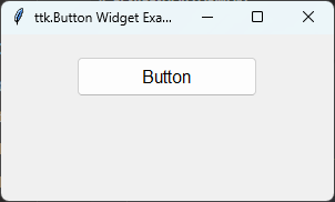
pressed
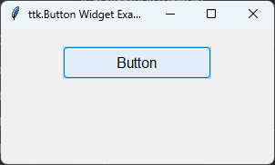
import tkinter as tk
from tkinter import ttk

root = tk.Tk()
root.title("ttk.Button Widget Example")
root.geometry("300x150")

# 1. Create a Style object
style = ttk.Style()

# 2. Configure a custom style layout for TButton
style.configure(
    "Custom.TButton",
    font=("Arial", 12),
    width=15,
    padding=(10, 5) # horizontal, vertical
)

# Note: Modern ttk uses dynamic maps for states like active/pressed
style.map(
    "Custom.TButton",
    foreground=[("pressed", "white"), ("active", "black")],
    background=[("pressed", "blue"), ("active", "lightblue")]
)

# 3. Apply the custom style to the ttk.Button
button = ttk.Button(
    root,
    text="Button",
    style="Custom.TButton"
)

button.pack(padx=20, pady=20)

root.mainloop()
Tasks
Modify the code above to change the window title to "ttk Button question," set the window size to 350x100, set the button text to "Click Me", use a custom style mapping a light gray background and black text color under normal conditions, a black background and white text when pressed/clicked, Arial font size 14, a width of 15, horizontal inside padding of 10, vertical inside padding of 5, and adjust the pack method to add padding of 20 pixels on all sides.

Modify the code above to meet the task requirements. .. code-block:: python
import tkinter as tk from tkinter import ttk
# Create a new window root = tk.Tk()
# Set the title of the window root.title("ttk Button question")
# Set the size of the window root.geometry("350x100")
# Instantiate the style style = ttk.Style()
# Define the base properties style.configure(
"Task.TButton", font=("Arial", 14), width=15, padding=(10, 5)
)
# Dynamic state map for color behaviors style.map(
"Task.TButton", background=[("pressed", "black"), ("active", "lightgray"), ("!disabled", "lightgray")], foreground=[("pressed", "white"), ("active", "black"), ("!disabled", "black")]
)
# Create the themed button button = ttk.Button(
root, text="Click Me", style="Task.TButton"
)
button.pack(padx=20, pady=20)
root.mainloop()
5.3. Parameter & Style Syntax
- button_widget = ttk.Button(parent, option=value)
- parent is the window or frame object.Options can be passed as parameters separated by commas or handled globally via ttk.Style().
Direct Widget Parameters:
- command
- Syntax:
button_widget = ttk.Button(parent, command=callback_function)Description: Specifies the function to be called when the button is clicked.Default:NoneExample:button_widget = ttk.Button(root, command=on_click)
- image
- Syntax:
button_widget = ttk.Button(parent, image=image_object)Description: Sets an image to be displayed on the button.Default:NoneExample:button_widget = ttk.Button(root, image=my_image)
- state
- Syntax:
button_widget = ttk.Button(parent, state="state")Description: Sets the core operational state of the button. Core values are"normal"and"disabled".Default:"normal"Example:button_widget = ttk.Button(root, state="disabled")
- text
- Syntax:
button_widget = ttk.Button(parent, text="text")Description: Sets the text string displayed on the button surface.Default:""Example:button_widget = ttk.Button(root, text="Click Me")
- textvariable
- Syntax:
button_widget = ttk.Button(parent, textvariable=stringvar)Description: Binds a StringVar variable to the text, enabling real-time content updates.Default:NoneExample:button_widget = ttk.Button(root, textvariable=my_var)
- underline
- Syntax:
button_widget = ttk.Button(parent, underline=index)Description: Specifies the character index to underline for keyboard mnemonic access.Default:-1(No underline)Example:button_widget = ttk.Button(root, text="Save", underline=1)
Theme Configuration Attributes (via style.configure / style.map):
- background
- Layout Syntax:
style.configure("TButton", background="color")Description: Adjusts standard background colors (Note: Behavior varies depending on the active OS platform theme).Example:style.configure("Custom.TButton", background="lightgray")
- font
- Layout Syntax:
style.configure("TButton", font=("font_name", size))Description: Sets the font styling rules for button text.Example:style.configure("Custom.TButton", font=("Arial", 12))
- foreground
- Layout Syntax:
style.configure("TButton", foreground="color")Description: Changes the text color.Example:style.configure("Custom.TButton", foreground="black")
- padding
- Layout Syntax:
style.configure("TButton", padding=(horizontal, vertical))Description: Dictates inside buffer spacing around the text content.Example:style.configure("Custom.TButton", padding=(10, 5))
- width
- Layout Syntax:
style.configure("TButton", width=width_in_chars)Description: Sets the button frame sizing metric based on uniform character lengths.Example:style.configure("Custom.TButton", width=15)
5.4. Inspecting Element Layout Options
import tkinter as tk
from tkinter import ttk

root = tk.Tk()
style = ttk.Style()

# Query elements structure layout configurations
print("Button Layout Structure:", style.layout("TButton"))

# Check default element options mapping configuration rules
print("Configured Options properties:", style.element_options("Button.label"))