tk Text
Usage
The tkinter.Text widget provides a versatile multi-line text area that you can use for various purposes such as comments or descriptions
To create a multi-line text widget the general syntax is (assuming import via "import tkinter as tk"):
- text_widget = tk.Text(parent, option=value)
- parent is the window or frame object.Options can be passed as parameters separated by commas.
Text widget with text altered by buttons
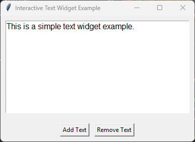
import tkinter as tk

# Create the main window
root = tk.Tk()
root.title("Interactive Text Widget Example")

# Create a StringVar to hold the text content
text_var = tk.StringVar()
text_var.set("This is a simple text widget example.")

# Create a Text widget
text = tk.Text(root, height=10, width=40, wrap="word", font=("Helvetica", 12))
text.pack(padx=10, pady=10, fill="both", expand=True)

# Insert initial content from StringVar
text.insert("1.0", text_var.get())

# Function to add text
def add_text():
    text.insert("end", "\nAdditional text added.")

# Function to remove text
def remove_text():
    text.delete("2.0", "end")

# Create buttons to add and remove text
button_frame = tk.Frame(root)
button_frame.pack(pady=10)

add_button = tk.Button(button_frame, text="Add Text", command=add_text)
add_button.pack(side="left", padx=5)

remove_button = tk.Button(button_frame, text="Remove Text", command=remove_text)
remove_button.pack(side="left", padx=5)

# Run the main event loop
root.mainloop()
Text widget with Scrollbar
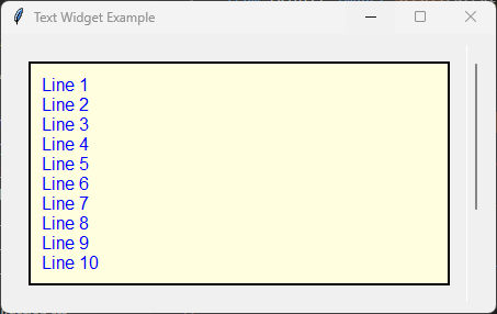
import tkinter as tk
# from tkinter import scrolledtext

Create the main window
root = tk.Tk()
root.title("Text Widget Example")

Create a Text widget with a scrollbar
text_frame = tk.Frame(root)
text_frame.pack(padx=10, pady=10, fill="both", expand=True)

scrollbar = tk.Scrollbar(text_frame)
scrollbar.pack(side="right", fill="y")

text = tk.Text(text_frame, height=10, width=40, wrap="word", font=("Helvetica", 12), yscrollcommand=scrollbar.set)
text.pack(padx=10, pady=10, fill="both", expand=True)

scrollbar.config(command=text.yview)

Insert initial content
initial_content = "\n".join([f"Line {i+1}" for i in range(15)])
text.insert("1.0", initial_content)

Customize options
text.config(
    bg="lightyellow",  Background color
    fg="blue",  Text color
    bd=2,  Border width
    relief="solid",  Border style
    insertbackground="blue",  Insertion cursor color
    state="normal",  Enable editing (use "disabled" to disable)
    highlightthickness=5,
    highlightcolor="red",
    padx=10,
    pady=10
)

Run the main event loop
root.mainloop()
Parameter syntax
- text_widget = tk.Text(parent, option=value)
Parameters:
- autoseparators
text_widget = tk.Text(parent, autoseparators=1)Description: Enables automatic separator insertion when typing.Default: 1Example:text_widget = tk.Text(root, autoseparators=1)
- background
text_widget = tk.Text(parent, background="color")Description: Sets the background color of the text widget.Default: SystemWindowExample:text_widget = tk.Text(root, background="lightyellow")
- bd
text_widget = tk.Text(parent, bd=border_width)Description: Sets the border width of the text widget.Default: 1Example:text_widget = tk.Text(root, bd=2)
- bg
text_widget = tk.Text(parent, bg="color")Description: Sets the background color of the text widget.Default: SystemWindowExample:text_widget = tk.Text(root, bg="lightyellow")
- blockcursor
text_widget = tk.Text(parent, blockcursor=0)Description: Sets the cursor style; a block or normal cursor.Default: 0Example:text_widget = tk.Text(root, blockcursor=1)
- borderwidth
text_widget = tk.Text(parent, borderwidth=width)Description: Sets the width of the border around the text widget.Default: 1Example:text_widget = tk.Text(root, borderwidth=2)
- cursor
text_widget = tk.Text(parent, cursor="cursor_type")Description: Sets the mouse cursor when hovering over the text widget.Default: xtermExample:text_widget = tk.Text(root, cursor="hand2")
- endline
text_widget = tk.Text(parent, endline="")Description: Sets the endline character for new lines.Default: NoneExample:text_widget = tk.Text(root, endline="\n")
- exportselection
text_widget = tk.Text(parent, exportselection=1)Description: Allows the text selection to be copied to the clipboard.Default: 1Example:text_widget = tk.Text(root, exportselection=1)
- fg
text_widget = tk.Text(parent, fg="color")Description: Sets the foreground color (text color) of the text widget.Default: SystemWindowTextExample:text_widget = tk.Text(root, fg="black")
- font
text_widget = tk.Text(parent, font=("font_name", size, "style"))Description: Specifies the font type, size, and style for the text.Default: TkFixedFontExample:text_widget = tk.Text(root, font=("Arial", 12, "italic"))
- foreground
text_widget = tk.Text(parent, foreground="color")Description: Sets the foreground color (text color) of the text widget.Default: SystemWindowTextExample:text_widget = tk.Text(root, foreground="black")
- height
text_widget = tk.Text(parent, height=height_value)Description: Sets the height of the text widget in lines.Default: 24Example:text_widget = tk.Text(root, height=10)
- highlightbackground
text_widget = tk.Text(parent, highlightbackground="color")Description: Sets the background color when the text widget does not have focus.Default: SystemButtonFaceExample:text_widget = tk.Text(root, highlightbackground="gray")
- highlightcolor
text_widget = tk.Text(parent, highlightcolor="color")Description: Sets the color of the highlight when the text widget has focus.Default: SystemWindowFrameExample:text_widget = tk.Text(root, highlightcolor="blue")
- highlightthickness
text_widget = tk.Text(parent, highlightthickness=thickness)Description: Sets the thickness of the highlight border.Default: 0Example:text_widget = tk.Text(root, highlightthickness=2)
- inactiveselectbackground
text_widget = tk.Text(parent, inactiveselectbackground="color")Description: Sets the background color for selected text when the widget is inactive.Default: NoneExample:text_widget = tk.Text(root, inactiveselectbackground="lightgray")
- insertbackground
text_widget = tk.Text(parent, insertbackground="color")Description: Sets the color of the insertion cursor (caret).Default: SystemWindowTextExample:text_widget = tk.Text(root, insertbackground="red")
- insertborderwidth
text_widget = tk.Text(parent, insertborderwidth=width)Description: Sets the width of the border around the insertion cursor.Default: 0Example:text_widget = tk.Text(root, insertborderwidth=2)
- insertofftime
text_widget = tk.Text(parent, insertofftime=milliseconds)Description: Sets the time the cursor stays off (in milliseconds).Default: 300Example:text_widget = tk.Text(root, insertofftime=500)
- insertontime
text_widget = tk.Text(parent, insertontime=milliseconds)Description: Sets the time the cursor stays on (in milliseconds).Default: 600Example:text_widget = tk.Text(root, insertontime=800)
- insertunfocussed
text_widget = tk.Text(parent, insertunfocussed="style")Description: Sets the style of the cursor when the widget is unfocused.Default: noneExample:text_widget = tk.Text(root, insertunfocussed="underline")
- insertwidth
text_widget = tk.Text(parent, insertwidth=width)Description: Sets the width of the insertion cursor.Default: 2Example:text_widget = tk.Text(root, insertwidth=5)
- maxundo
text_widget = tk.Text(parent, maxundo=number)Description: Sets the maximum number of undo operations.Default: 0 (unlimited)Example:text_widget = tk.Text(root, maxundo=100)
- padx
text_widget = tk.Text(parent, padx=padding_value)Description: Sets the horizontal padding within the text widget.Default: 1Example:text_widget = tk.Text(root, padx=10)
- pady
text_widget = tk.Text(parent, pady=padding_value)Description: Sets the vertical padding within the text widget.Default: 1Example:text_widget = tk.Text(root, pady=10)
- relief
text_widget = tk.Text(parent, relief="style")Description: Sets the border style of the text widget. Options include flat, raised, sunken, groove, ridge.Default: sunkenExample:text_widget = tk.Text(root, relief="flat")
- selectbackground
text_widget = tk.Text(parent, selectbackground="color")Description: Sets the background color of the selected text.Default: SystemHighlightExample:text_widget = tk.Text(root, selectbackground="lightblue")
- selectborderwidth
text_widget = tk.Text(parent, selectborderwidth=width)Description: Sets the border width of the selection.Default: 0Example:text_widget = tk.Text(root, selectborderwidth=1)
- selectforeground
text_widget = tk.Text(parent, selectforeground="color")Description: Sets the text color of the selected text.Default: SystemHighlightTextExample:text_widget = tk.Text(root, selectforeground="white")
- setgrid
text_widget = tk.Text(parent, setgrid=0)Description: Enables or disables grid lines in the text widget.Default: 0Example:text_widget = tk.Text(root, setgrid=1)
- spacing1
text_widget = tk.Text(parent, spacing1=spacing_value)Description: Sets the spacing before paragraphs.Default: 0Example:text_widget = tk.Text(root, spacing1=5)
- spacing2
text_widget = tk.Text(parent, spacing2=spacing_value)Description: Sets the spacing between lines.Default: 0Example:text_widget = tk.Text(root, spacing2=3)
- spacing3
text_widget = tk.Text(parent, spacing3=spacing_value)Description: Sets the spacing after paragraphs.Default: 0Example:text_widget = tk.Text(root, spacing3=5)
- startline
text_widget = tk.Text(parent, startline="")Description: Sets the starting line number for text.Default: NoneExample:text_widget = tk.Text(root, startline=1)
- state
text_widget = tk.Text(parent, state="state_type")Description: Sets the state of the text widget. Options include normal, disabled, or hidden.Default: normalExample:text_widget = tk.Text(root, state="disabled")
- tabs
text_widget = tk.Text(parent, tabs=tab_stops)Description: Sets tab stops for the text widget.Default: NoneExample:text_widget = tk.Text(root, tabs=4)
- tabstyle
text_widget = tk.Text(parent, tabstyle="style")Description: Specifies the style for tab stops. Options include tabular.Default: tabularExample:text_widget = tk.Text(root, tabstyle="tabular")
- takefocus
text_widget = tk.Text(parent, takefocus=1)Description: Allows the text widget to take focus on click.Default: NoneExample:text_widget = tk.Text(root, takefocus=1)
- undo
text_widget = tk.Text(parent, undo=0)Description: Enables the undo feature for the text widget.Default: 0Example:text_widget = tk.Text(root, undo=1)
- width
text_widget = tk.Text(parent, width=width_value)Description: Sets the width of the text widget in characters.Default: 80Example:text_widget = tk.Text(root, width=50)
- wrap
text_widget = tk.Text(parent, wrap="mode")Description: Sets the text wrapping mode. Options are none, char, or word.Default: charExample:text_widget = tk.Text(root, wrap="word")
- xscrollcommand
text_widget = tk.Text(parent, xscrollcommand=command)Description: Configures the command for horizontal scrolling.Default: NoneExample:text_widget = tk.Text(root, xscrollcommand=my_xscroll_command)
- yscrollcommand
text_widget = tk.Text(parent, yscrollcommand=command)Description: Configures the command for vertical scrolling.Default: NoneExample:text_widget = tk.Text(root, yscrollcommand=my_yscroll_command)