tk LabelFrame
Usage
- labelframe_widget = tk.LabelFrame(parent, option=value)
- parent is the window or frame object.Options can be passed as parameters separated by commas.
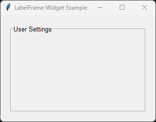
Sample LabelFrame
import tkinter as tk

root = tk.Tk()
root.title("LabelFrame Widget Example")
root.geometry("320x220")

settings = tk.LabelFrame(
    root,
    text="User Settings",
    font=("Arial", 10),
    padx=10,
    pady=10,
    bd=2,
    relief="groove"
)

settings.pack(padx=20, pady=20, fill="both", expand=True)

root.mainloop()
Tasks
Modify the code so that it creates a
LabelFrameto contain user preferences.Set the title of the
LabelFrameto "User Settings".Use an Arial font size 12 for the label.
Add internal padding of 15 pixels horizontally and vertically.
Set the border width to 3.
Use a
grooveborder style.Make the
LabelFramefill the window.
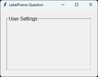
Modify the code so that it creates a LabelFrame with the required settings.
import tkinter as tk

# Create the main window
root = tk.Tk()
root.title("LabelFrame Question")
root.geometry("320x220")

# Create the LabelFrame
settings = tk.LabelFrame(
    root,
    text="User Settings",
    font=("Arial", 12),
    padx=15,
    pady=15,
    bd=3,
    relief="groove"
)

# Display the LabelFrame
settings.pack(
    padx=20,
    pady=20,
    fill="both",
    expand=True
)

# Run the main event loop
root.mainloop()
When to use a LabelFrame
A LabelFrame is useful when related widgets should be grouped together and identified with a descriptive title.
Typical uses include:
User details
Network settings
Display options
File selection controls
Search filters
Preferences and configuration dialogs
Parameter syntax
Note
The width and height options only specify the requested size.
If the LabelFrame contains widgets, it will normally resize itself to fit them.
To force the LabelFrame to keep its specified size, disable geometry propagation.
labelframe.pack_propagate(False)
# or
labelframe.grid_propagate(False)
- labelframe_widget = tk.LabelFrame(parent, option=value)
Parameters:
- background
- bg
- Syntax:
labelframe_widget = tk.LabelFrame(parent, bg="color")Description: Sets the background color of the LabelFrame.Default: SystemButtonFace
- borderwidth
- bd
- Syntax:
labelframe_widget = tk.LabelFrame(parent, bd=width)Description: Sets the width of the LabelFrame border.Default:0
- cursor
- Syntax:
labelframe_widget = tk.LabelFrame(parent, cursor="cursor_type")Description: Changes the mouse cursor when it hovers over the LabelFrame.
- font
- Syntax:
labelframe_widget = tk.LabelFrame(parent, font=("Arial", 10, "bold"))Description: Sets the font used for the LabelFrame title.Default: System default font.
- foreground
- fg
- Syntax:
labelframe_widget = tk.LabelFrame(parent, fg="blue")Description: Sets the color of the LabelFrame title.
- height
- Syntax:
labelframe_widget = tk.LabelFrame(parent, height=height_in_pixels)Description: Sets the height of the LabelFrame in pixels.Default:0
- highlightbackground
- Syntax:
labelframe_widget = tk.LabelFrame(parent, highlightbackground="color")Description: Sets the color of the focus highlight when the LabelFrame does not have focus.
- highlightcolor
- Syntax:
labelframe_widget = tk.LabelFrame(parent, highlightcolor="color")Description: Sets the color of the focus highlight when the LabelFrame has focus.
- highlightthickness
- Syntax:
labelframe_widget = tk.LabelFrame(parent, highlightthickness=thickness)Description: Sets the thickness of the focus highlight.Default:0
- labelanchor
- Syntax:
labelframe_widget = tk.LabelFrame(parent, labelanchor="nw")Description: Specifies the position of the LabelFrame title around the border.Default:"nw"Valid values:
Value
Position
nTop centre.
neTop right.
nwTop left (default).
eRight side.
wLeft side.
sBottom centre.
seBottom right.
swBottom left.
- padx
- Syntax:
labelframe_widget = tk.LabelFrame(parent, padx=padding)Description: Sets the horizontal padding inside the LabelFrame.
- pady
- Syntax:
labelframe_widget = tk.LabelFrame(parent, pady=padding)Description: Sets the vertical padding inside the LabelFrame.
- relief
- Syntax:
labelframe_widget = tk.LabelFrame(parent, relief="relief_type")Description: Sets the border style of the LabelFrame.Values include"flat","raised","sunken","ridge","solid", and"groove".Default:"groove"
- takefocus
- Syntax:
labelframe_widget = tk.LabelFrame(parent, takefocus=True)Description: Determines whether the LabelFrame can receive keyboard focus.Default:0
- text
- Syntax:
labelframe_widget = tk.LabelFrame(parent, text="Settings")Description: Sets the text displayed as the LabelFrame title.Default:""
- width
- Syntax:
labelframe_widget = tk.LabelFrame(parent, width=width_in_pixels)Description: Sets the width of the LabelFrame in pixels.Default:0
Default options
Labelframe option is shown below.import tkinter as tk
root = tk.Tk()
widget = tk.Labelframe(root)
widget_options = widget.keys()
for option in widget_options:
print(f"{option}: {widget.cget(option)}") # cget retrieves the current value of the option